Accessibility 101: The Big Picture

- foxtrotzulu94
- Aug. 3, 2019
Photograph in black and white of a white woman with short hair sitted by a table in a classroom. Her head is down, indicating she is focused on the work she is doing. Using a digital magnifier in her left hand and an automatic pencil in her right hand, she does measurements to do markings on a A3 paper. By her side, two squares.
(Credit: contraexemplo - CC BY-SA 4.0)
It's been a while since I last wrote on here. I had been quite busy at work changing teams and learning some new things. And one of the most important things I learned with my new team was something I hadn't given much though about before: Accessibility in Software.
My new team at Microsoft owns a number of apps within Windows that were constantly being tested to see how accessible they were for our users. Engineers accross the team were tasked with fixing bugs within the apps related to screen reader interaction, high-contrast settings, keyboard-only navigation, scaled text and the digital magnifier use. And I was tasked with a number of bugs from day 1. This made me realize how little I knew about this and but also why it mattered so much.
Most developers are not prepared
Right up until I was assigned accessibility tasks and bugs with my new team, I had no clue whatsoever about what accessibility in software meant. And I think this tends to be the case for a lot of software developers out there right now. This is changing over time as companies and consumers begin to place a bigger emphasis on accessible experiences, but there are still many gaps in knowledge and in how we develop new software.
Chances are that even if you did a 4 year program at university to become a software developer, they likely didn't cover the challenges of accessibility or localization. Most of the experience in those two subjects seems to come from on-the-job learning and is borne out of need (i.e. we need to meet an accessibility standard or we need to translate for consumers in a particular region).
What this leads to is a set of issues where accessibility is either considered late in the design stage (if at all) or a tacked-on feature which seems more of an after thought. As a result, when software ships, User Experience is degraded in some way, shape or form and people who most need these features feel left out.
This is especially true in legacy software.

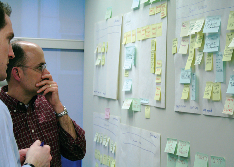
Any Modern software design should include accessibility as early as possible in order to shape the best user experience.
(Image by Rosenfeld Media - Source - CC BY 2.0)
The Problem
Let's step back for a minute and see what we're dealing with. We tend to think of computers and software as very visual things because we have a user interface: some window, buttons, icons, or even a command prompt. Now, ask yourself the following:
- If the mouse was unplugged, could you use the keyboard and be just as efficient as you are with a mouse?
- If you close your eyes, could someone describe what's on your screen and you'd know what's happening and what to do?
These questions scratch the surface of accessibility in software. And for user-facing applications to be truly accessible, the answer to those questions must be, unequivocally, yes.

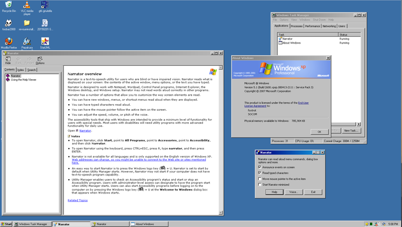
First introduced with Windows 2000, the Windows Narrator reached widespread consumer use with Microsoft's Windows XP
(Copyright 2007 Microsoft Corporation)
Before working on accessibility issues, I only thought of the Windows Narrator as this interesting application that was often the result of a strange (and mostly accidental) key combination: Ctrl+Win+Return. It wasn't until I attempted to reproduce Screen Reader bugs, when I literally closed my eyes and let Windows Narrator tell me what was on screen, that I realized how important that feature was if I had a visual imparment.
What can we do about it?
It's hard to address a problem like this if you don't put yourself in the shoes of others. Empathy is probably the most important value a software developer can have when addressing accessibility. Using any of your Operating System's built-in accessibility tools can show you the gap in the user experience and really change your perspective on how people and computers can interact
Even when purposefully designing for accessibility, we need to consider missed opportunities and how a design might be missing a certain dimension of the experience. But perhaps most importantly, how a piece of software can (and needs to) adapt the experience to meet their users needs.
At the same time, accessible technology has various levels of abstraction and technical challenges which I found amazing. Think about what APIs and data structures you need to have for an arbitrary program to read the contents of your screen to you. Both the Operating System, the applications running on it and (for example) a screen reader have to coordinate to adapt to a users need and deliver a seamless, non-disruptive experience.
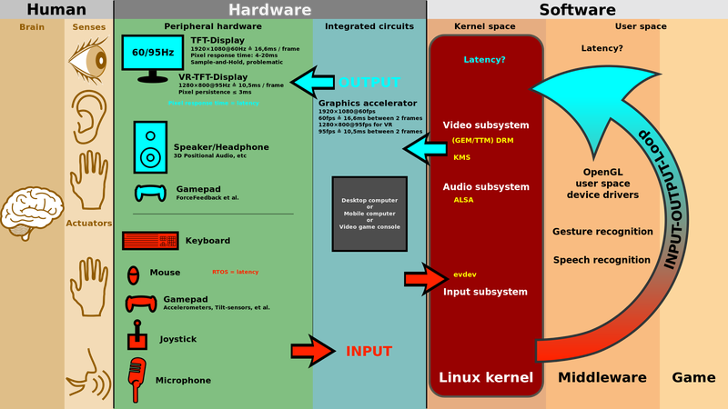
Likewise, accessible computing goes into hardware with more general Human Interface Devices (HID). Most people think about mouse and keyboard as all they would use to interact with a computer. But there are also Braille Terminals, eye control features and a healthy amount of custom peripherals to facilitate mechanical interaction.

The Big Picture shown with the Linux Kernel. It captures all the mechanical, electrical and software layers between our brain and the computer.
(Image by ScotXW - Source - CC BY-SA 3.0)
Accessibility is a design and technical challenge that really caught my attention once I started diving deep into it. It builds on top of a lot of multi-disciplinary work and it has a profound and visible impact on society when we make software that everyone can use and adapts to their particular needs.
I wanted to keep this post short and just give a bird's eye view of what accessible software means. I hope to follow up soon with another, more technical post about how all of this technology works under the hood and how developers have built it up over the years.